Parking Woes: Redesigning User-Friendly Parking Signs
Imagine this – you’re out shopping with your family, and you come back to find that your car has been towed. You parked in the wrong place. Sounds familiar? Chances are, this has happened to you at least once, or you know someone who has had a similar experience. Often, the blame falls on poorly designed parking signs – this is why Nikki Sylianteng, a Brooklyn-based designer, started redesigning user-friendly parking signs.
She noticed that focusing more on the usability of parking signs could do the trick and make the signs more useful for drivers.
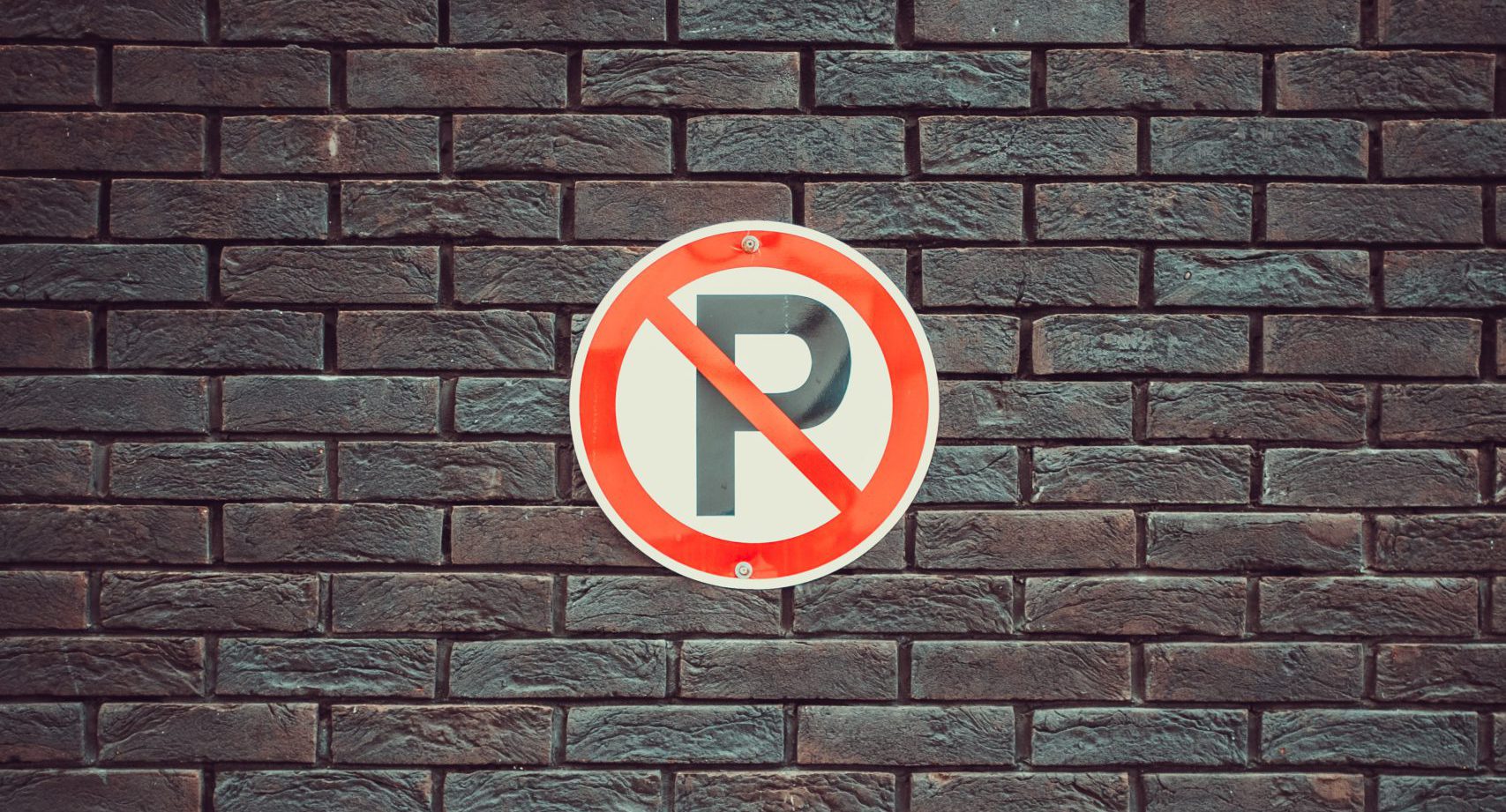
The problem of parking signs
40% of all car accidents that cause physical damage occur during parking. This statistic highlights the importance of parking signs even further. These signs are supposed to inform drivers of speed limits and security precautions to reduce accidents and injuries.
The problem with most parking signs is that they have limited space to communicate multiple guidelines and restrictions. Typically, a parking sign is supposed to answer 2 simple questions:
- Can you park your car here?
- How long can you park the car?
However, most signs are hard to read and understand for most passers-by and fail to answer these simple questions. Thus, a redesign is the only legible solution to this issue.
Urban parking is a far more complex issue than most people realize. In fact, spaces occupied by parked vehicles could become parks or even bike lanes. And unclear parking signs only add to the crisis.
To Park or Not to Park
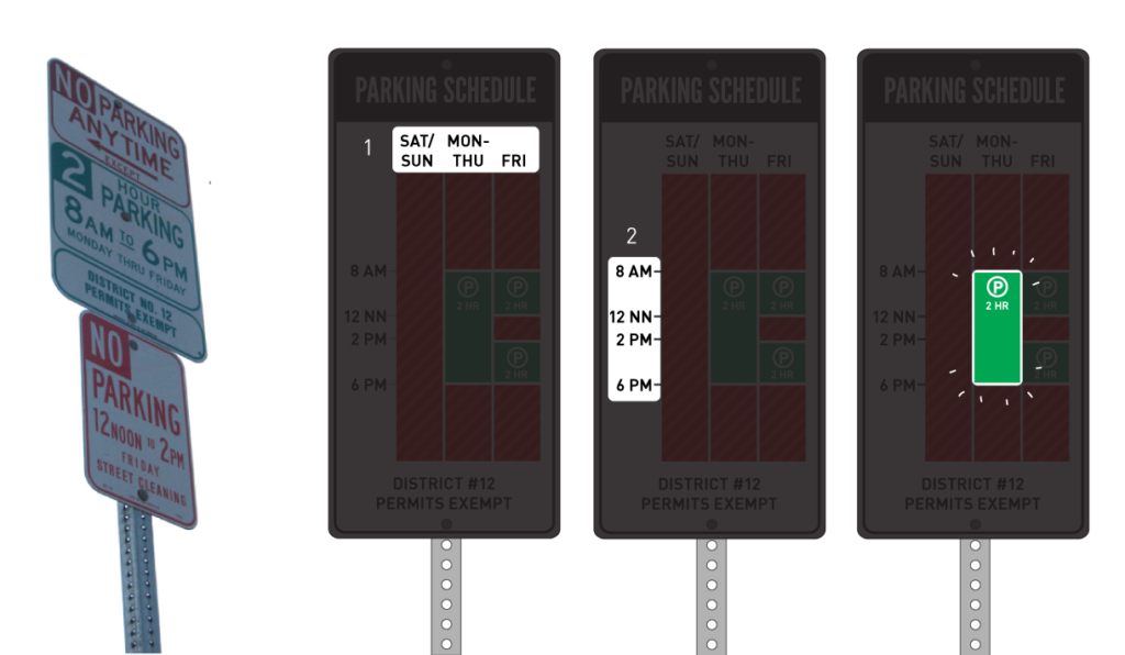
As part of her urban intervention and design project, ‘To Park or Not to Park’, designer Nikki Sylianteng decided to bring about some necessary changes to parking signs. Sylianteng translated all the critical information provided by a parking sign into a visual explanation that answered the abovementioned questions.
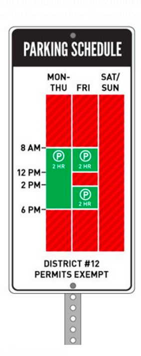
After going through multiple iterations, Sylianteng’s design features a parking schedule that displays 24 hours every day of the week. The street sign features a graphical representation of free parking and no-parking hours. The times when you can park your car are marked by green blocks, and the times you can’t are marked by blocks of red and white. Sylianteng released the prototype of the new parking signs outside her apartment in Brooklyn, New York, and received positive feedback.
Also Read: Designing Parking Lot Security
Why is redesigning User-Friendly Parking Signs make sense?
While the original parking signs were text-based and included extraneous information, the redesign focused on visuals. It provided a spatial visualization of time with days of the week and a 24-hour timeline. Sylianteng’s parking sign redesign got so popular that a number of cities worldwide have made an effort to incorporate her designs to improve parking signage. Cities including Los Angeles, New Haven, CT, and Brisbane, Australia have actively supported the redesign.
In Brisbane, a 3-month trial at 7 different locations with 600 drivers resulted in up to 60% improved compliance. Therefore, we can conclude that good design can undoubtedly lead to better outcomes, and good parking signage will help you avoid a few parking tickets in the future!